Designing a responsive website for Anew Mission, a b-corp* set up to help non-profits collaborate with the public.
My role: information architecture, user and competitor research, wire framing & visual design, prototyping, testing. I worked with a team including 2 other UX designers, I was primarily responsible for the visual/interaction design.
01_Understanding the opportunity
02_Discovery: user & competitor research
03_Defining the user need: personas & user flows
04_Developing the product: ideation, testing & iteration
05_Delivery & next steps

Find out more about Anew Mission here.
* b-corporations are for-profit companies certified by the non-profit B Lab to meet rigorous standards of social and environmental performance, accountability, and transparency.
01. Understanding the opportunity
The brief
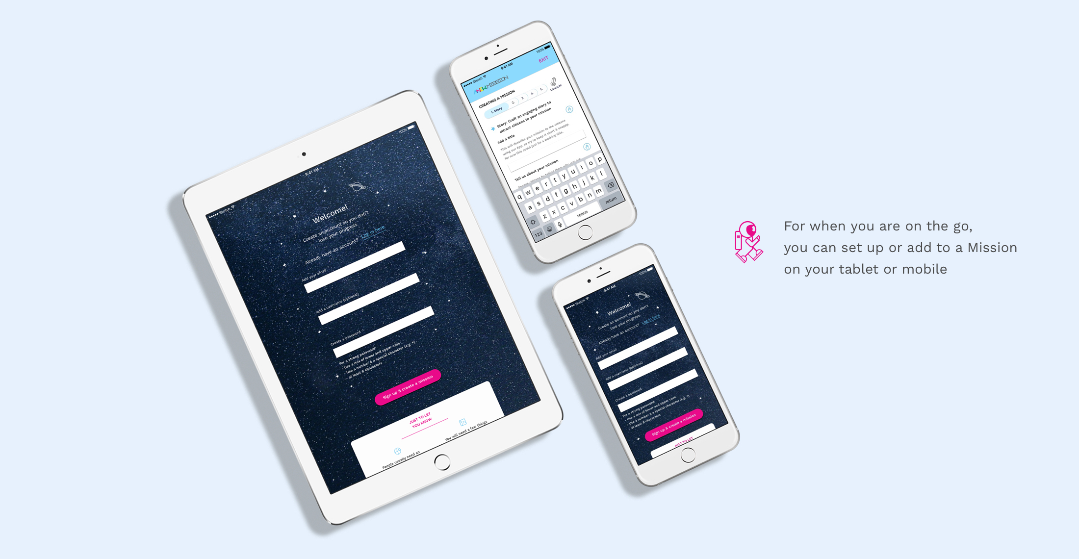
Originally the brief was simply to re-design the project set up process (i.e. how non-profits set up a Mission), but we quickly discovered we needed to design a site that could also communicate how the platform worked and the advantages it offered.
The opportunity
To help non-profits turn their goal into something tangible that has a positive impact on society, and to avoid them giving up because they don't understand the benefits - and/or because the process is too onerous.
The solution
An update to Anew Mission's responsive website to help non-profits understand the benefits of using Anew Mission’s platform to advance their goals, and an easy to use Mission creation process.
02. Discovery
User interviews
Once our brief was clear we started preparing for, and organising interviews with users from non-profits and others who had used similar platforms (e.g. kickstarter). We were lucky to be able to speak to a number of people from non-profits, including 2 charity founders and a programme manager from a larger charity (Save the Children).
We found that there were quite significant differences between the goals and frustrations of employees based on the size of their charities and their seniority. Our interviewees from smaller charities, and in more senior roles, were most concerned about getting expert help and telling a compelling "story" in order to attract supporters. Our interviewees from larger charities were most concerned about all the red tape involved in setting up a Mission, in particular getting senior management approval.
All users were also concerned about Missions being clearly ownable by the non-profit involved - in terms of keeping control over the ideas progressed, and being able to brand their Missions. They all had horror stories about obstructive platforms which had sometimes cost them funding or caused them to give up on the process.
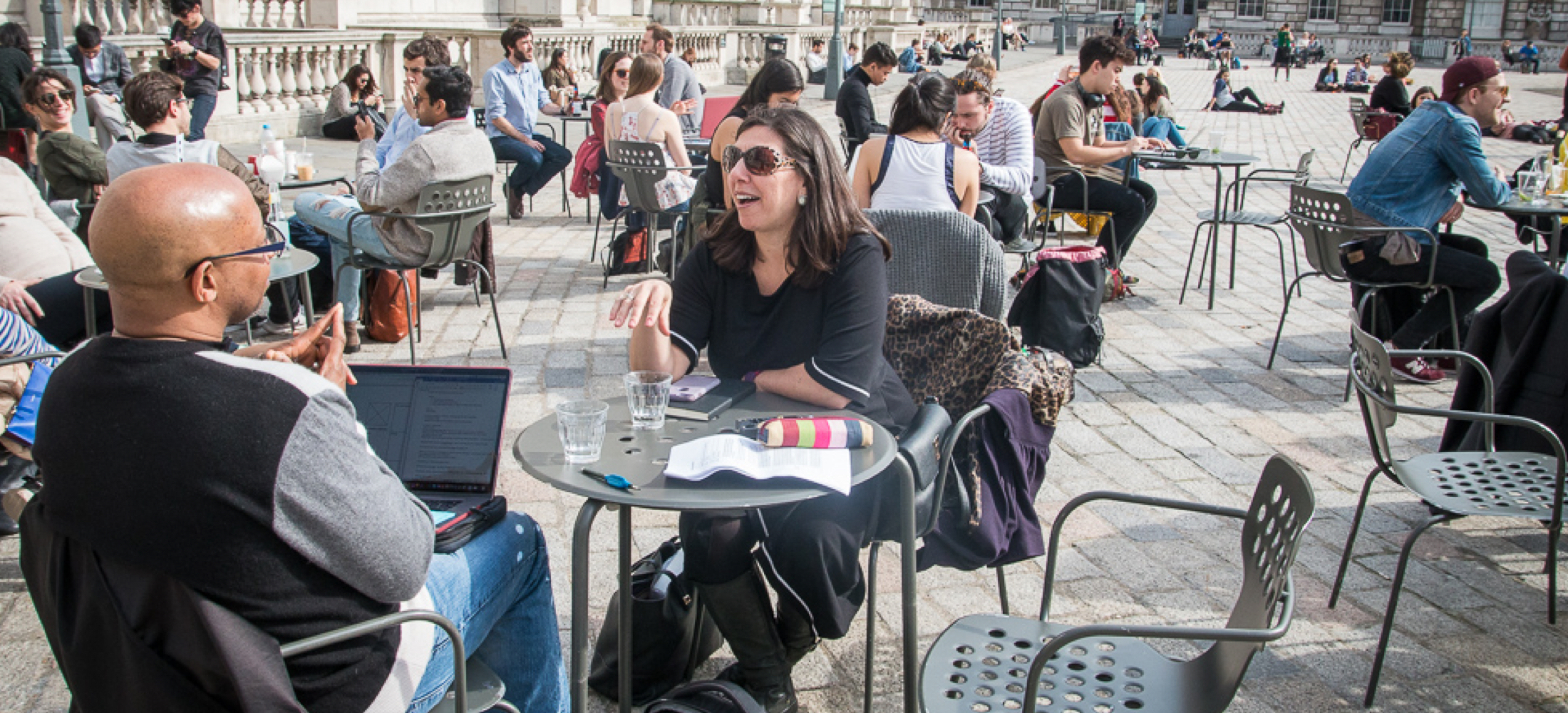
User Interviews - here we are interviewing Amy Shocker from Invincible Me at Somerset House.
Competitive Analysis
At the same time as conducting user research we started a competitive review. Our aim was to find what similar platforms were doing to support users, and what could be improved upon.
Our main findings were that:
- no one was really taking the same approach as Anew Mission, some supported collaboration but usually within teams of employees;
- the best processes requested information in small chunks split over steps and had good quality instructional videos and help text;
- many websites were still quite old fashioned and difficult to follow;
03. Defining the user need
Personas
The findings from our user interviews formed the basis for our 2 personas, Anna who is a charity founder from a small charity, and Liam who is a Programme Manager at a larger charity. We chose to focus primarily on Anna for the first stage of design work as she had more complex goals and frustrations.
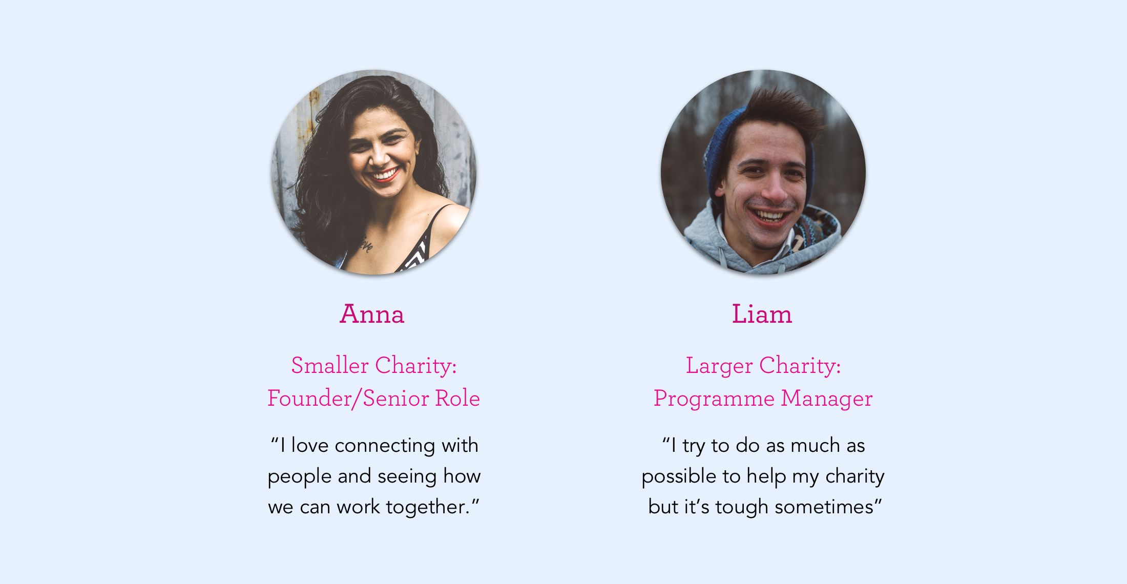
Our 2 Personas - Anna & Liam
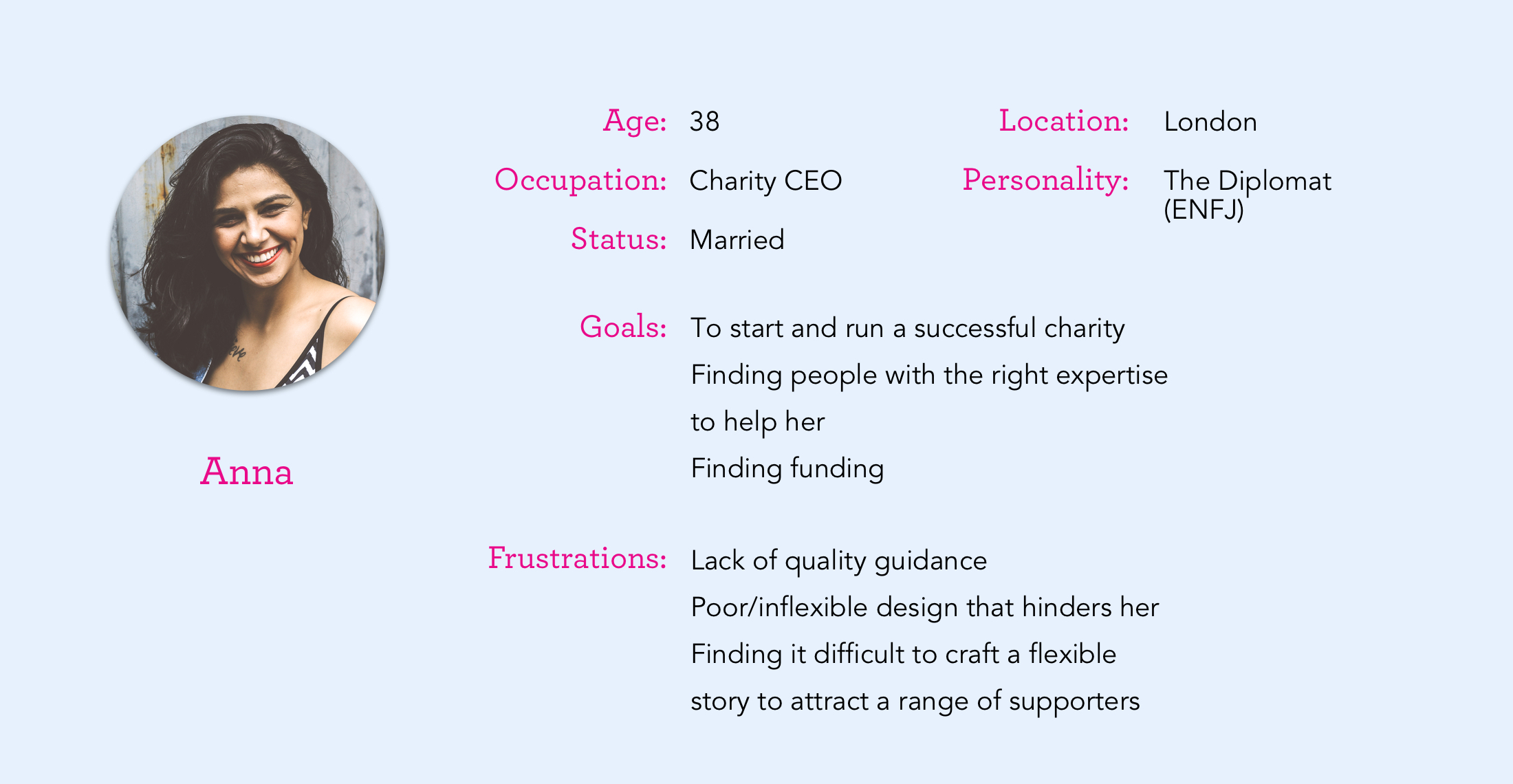
Our Key Persona - Anna
User Flow
Originally our brief was just to focus on the Mission creation process but we found that users did not understand what Anew Mission did, how they set up a Mission or why it was beneficial. Because of this we included browsing the home page, and understanding the benefits of Anew Mission in our user journeys and flows. The simplified user flow below shows the key steps of Anna's journey:

Anna's simplified user flow
04. Developing the product
Design Studio
We finished week 1 of the sprint with a design studio with our client, focussing on 2 challenges:
1. How can we help Anna understand the benefits of setting up a Mission?
2. How can we help Anna create a Mission?

Our Design Studio with the client
Feature Prioritisation
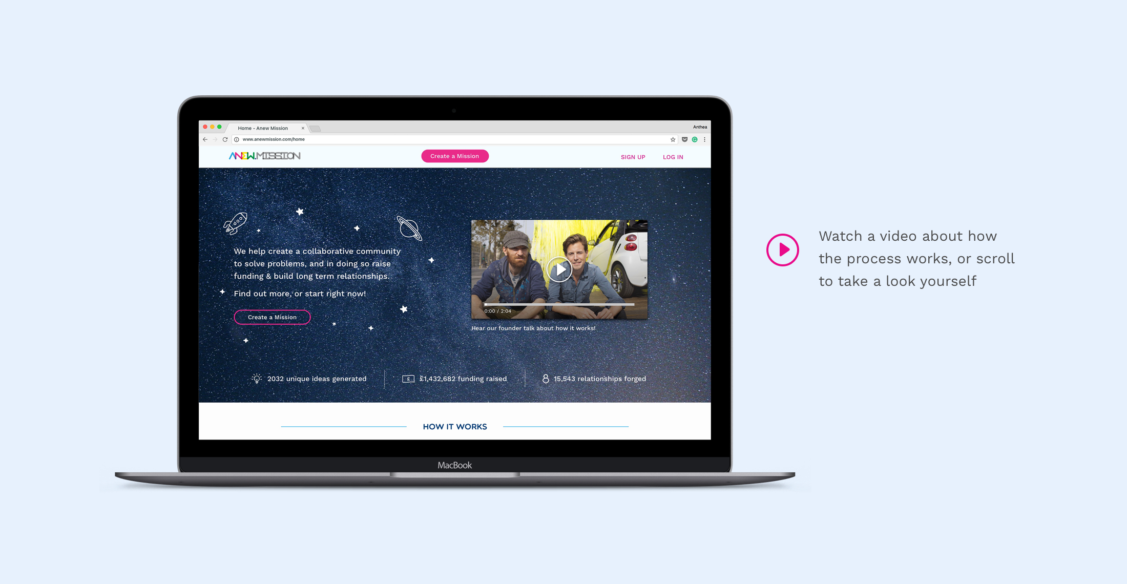
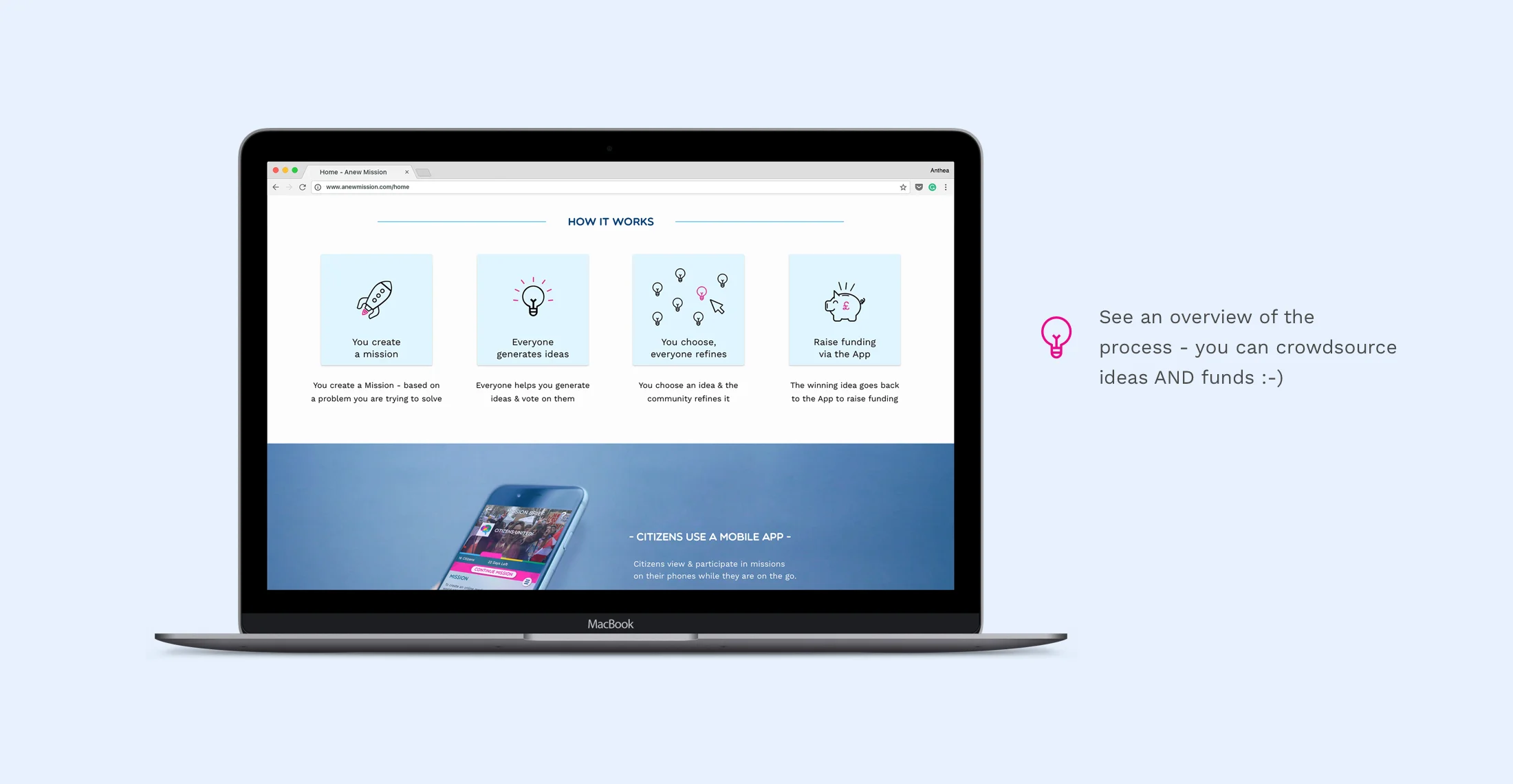
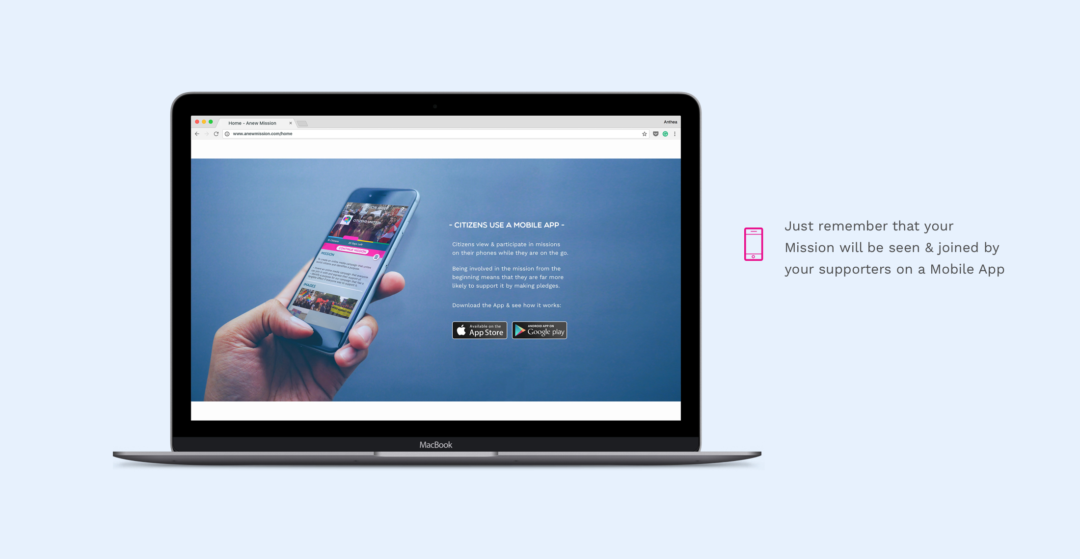
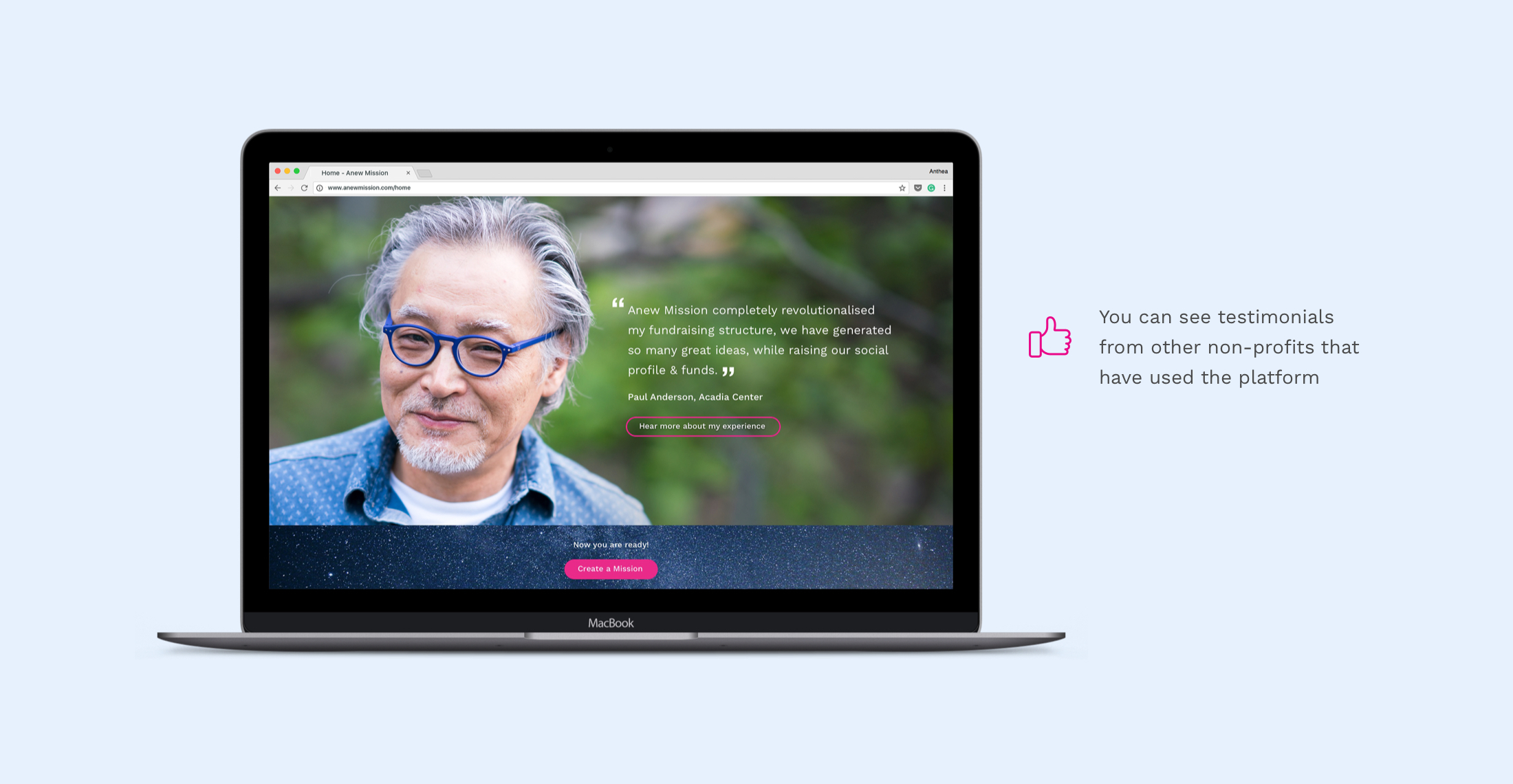
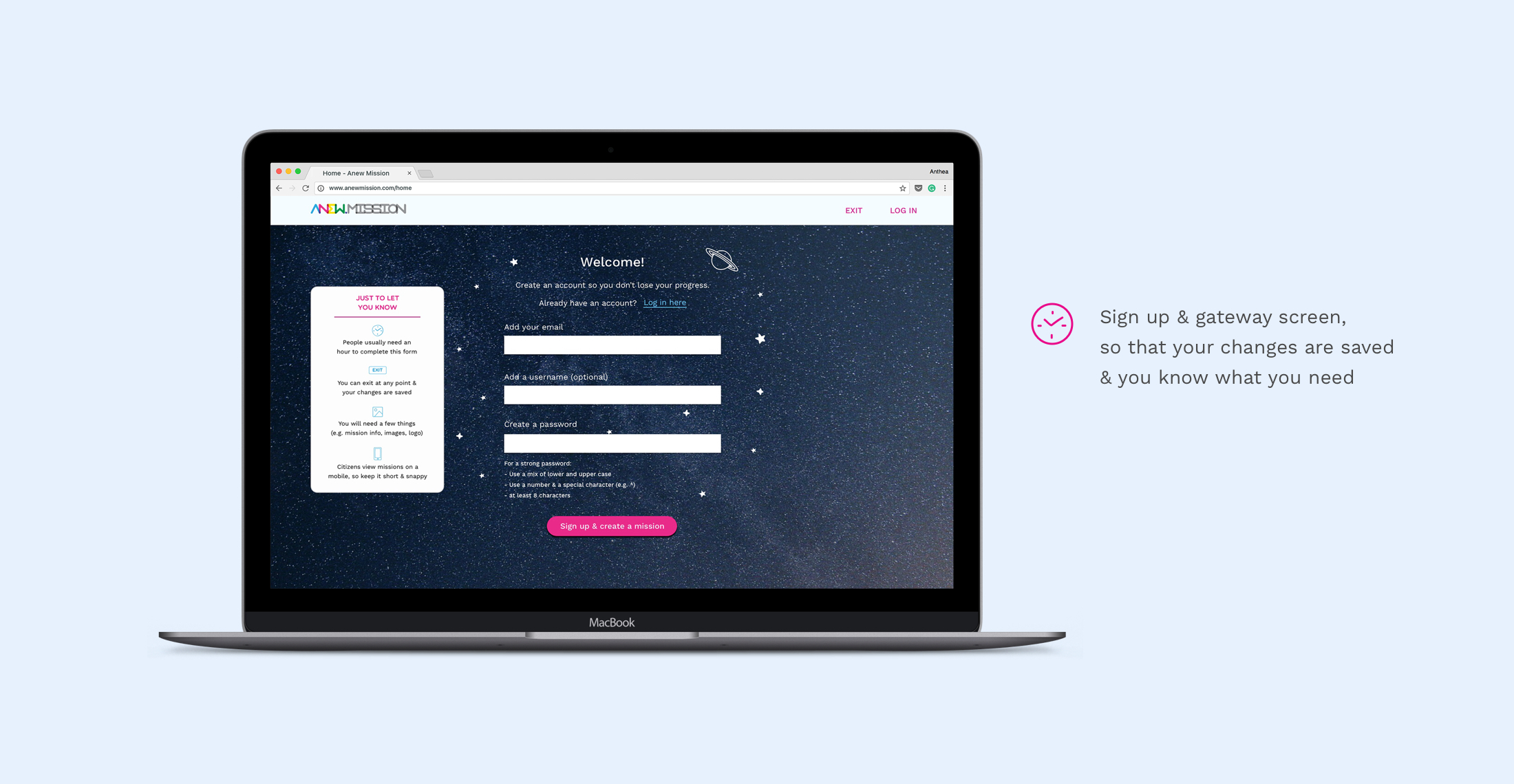
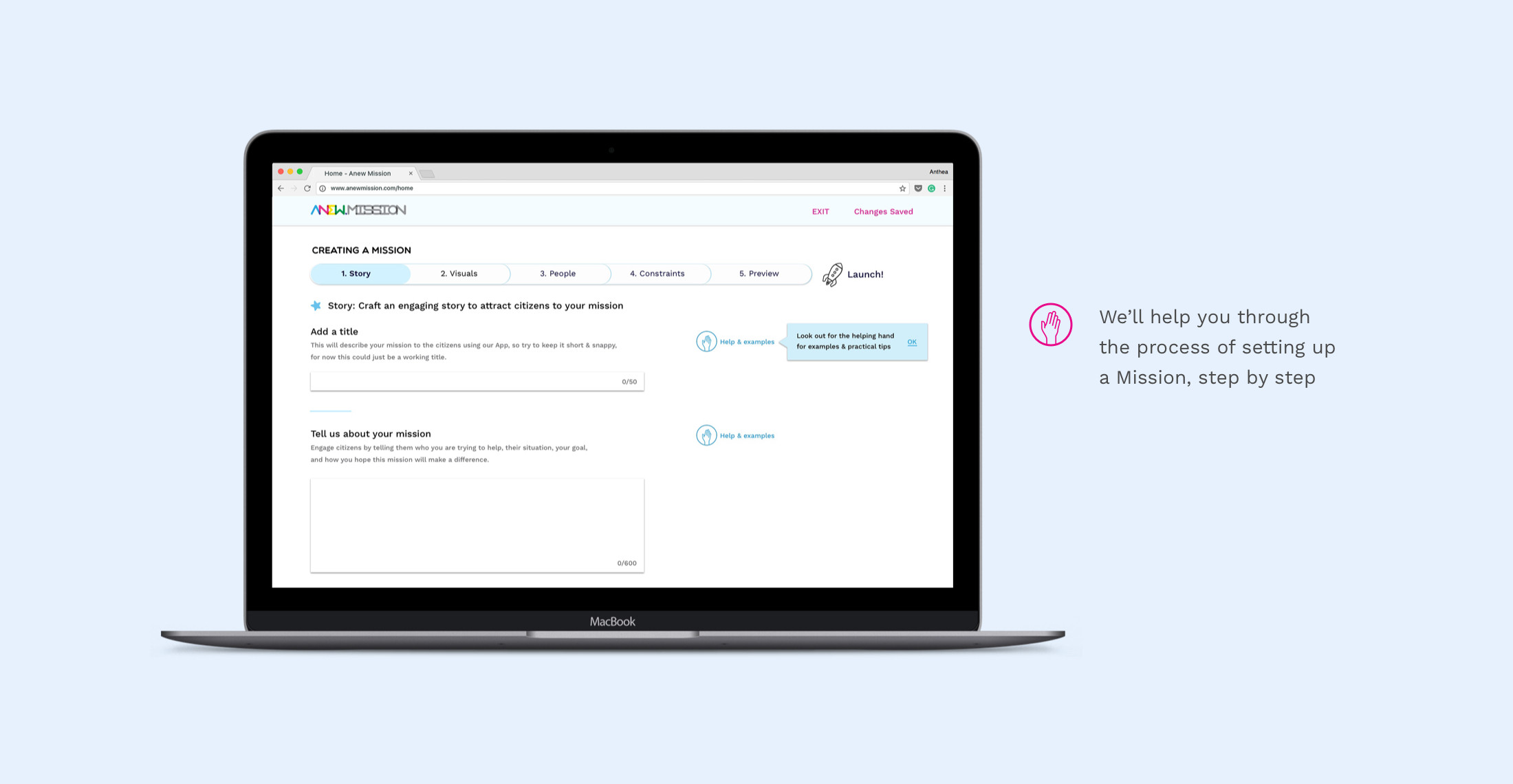
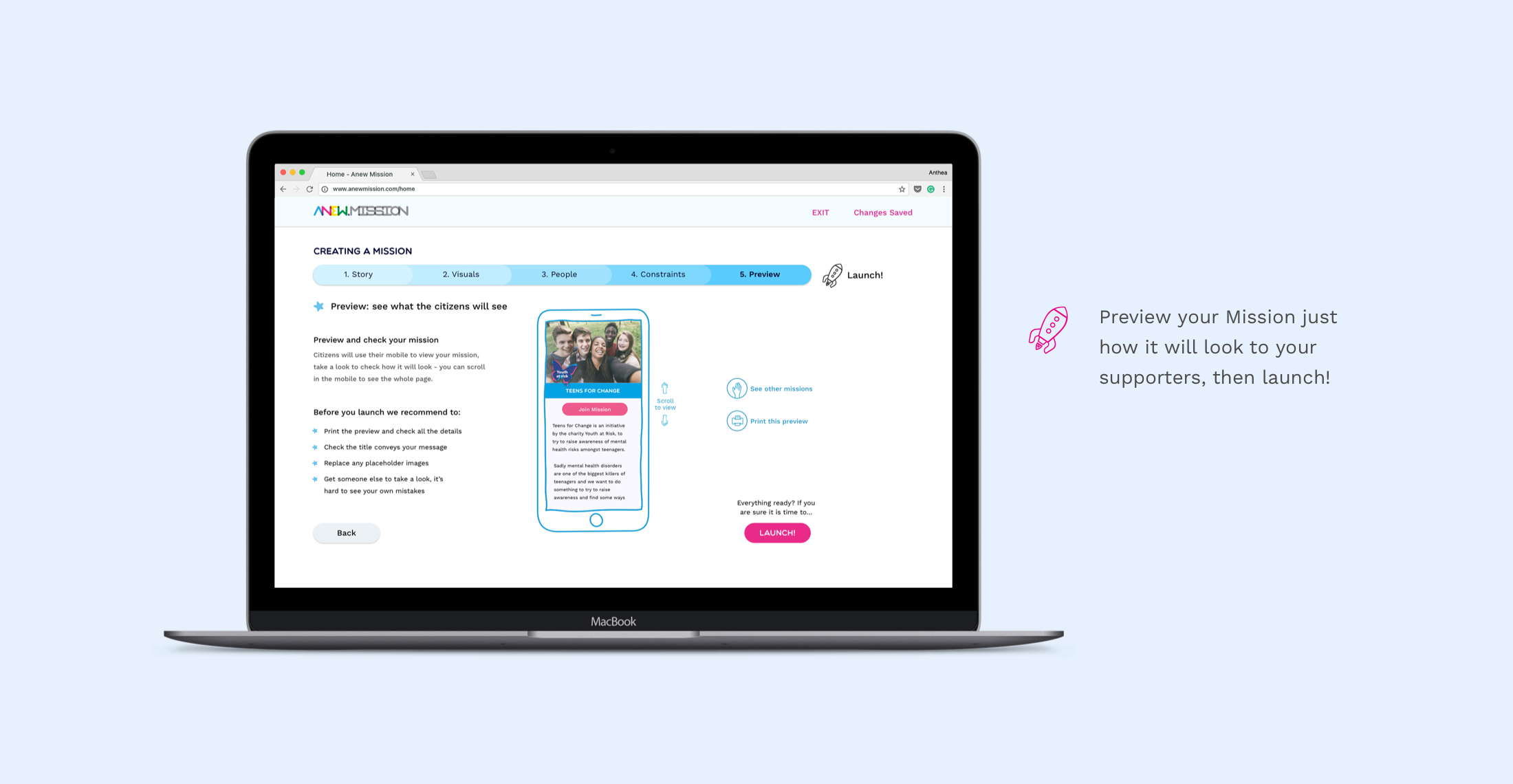
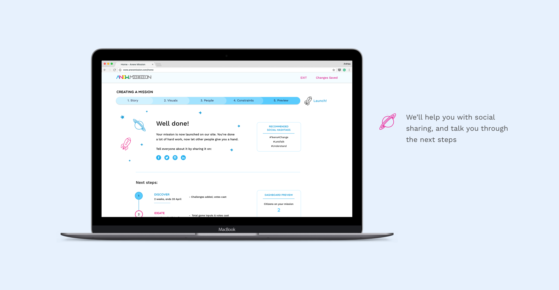
To kick off the second week of our 2 week sprint, we started to plan out the features we needed to include within the product. This was relatively straightforward as we all agreed that the process had to be as simple as possible. We wanted a simple home page that would spell out the process, provide testimonials, and some reassurance on the main problem areas that had been uncovered by our user research, and then a simplified Mission creation process that would follow form field best practice.
Copywriting
As we started sketching out early designs we realised that a huge part of our job would be to generate copy for the product, to convince users to try it out, as well as supporting users and offering words of encouragement. This was quite a daunting challenge as we had limited experience of copywriting and we knew that we wouldn't get accurate results if we tried to use placeholder copy. To rise to the challenge we conducted a copywriting workshop amongst the team to come up with wording and ensure that it had a consistent tone of voice.
Testing & Iteration
Starting at the beginning of the second week we also began to sketch out, test and refine our designs. Throughout the week we conducted the following testing: paper prototypes with 2 users, low fidelity digital wireframes with 6 users, mid fidelity digital wireframes with 4 users, and high fidelity digital wireframes with 2 users. We constantly iterated on the design based on the user testing throughout the week.
Our final round of user testing was very positive, with users understanding Anew Mission's proposition, completing the process much more quickly and successfully, and reporting that they found the process much more straightforward. One tester, our user from a large charity, even called the process "effortless" which was very rewarding!

Testing the low fidelity wireframes
05. Delivery & next steps
At the end of the project we delivered a stakeholder presentation, high fidelity prototype, and a detailed design specification including annotated wireframes and a detailed style guide, an example of some of the content is shown below. I was the team member responsible for creating the high fidelity wireframes and developing the visual language.
Our client was very impressed by how much we had achieved in 2 week, as well as the feasibility of our recommendations, and is currently assessing how to implement the designs.
Specification & style guide
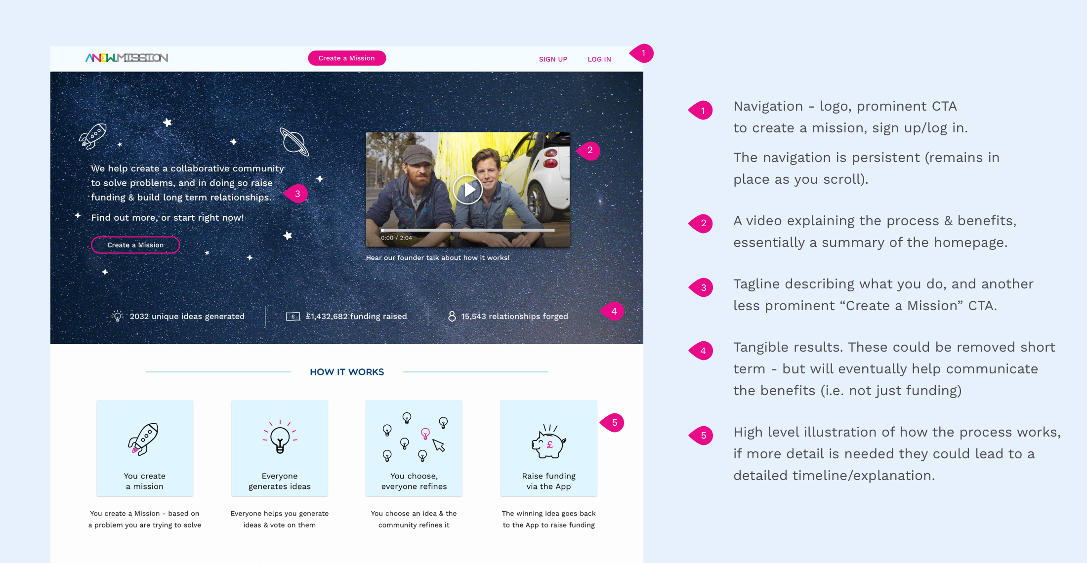
A sample of our design specification
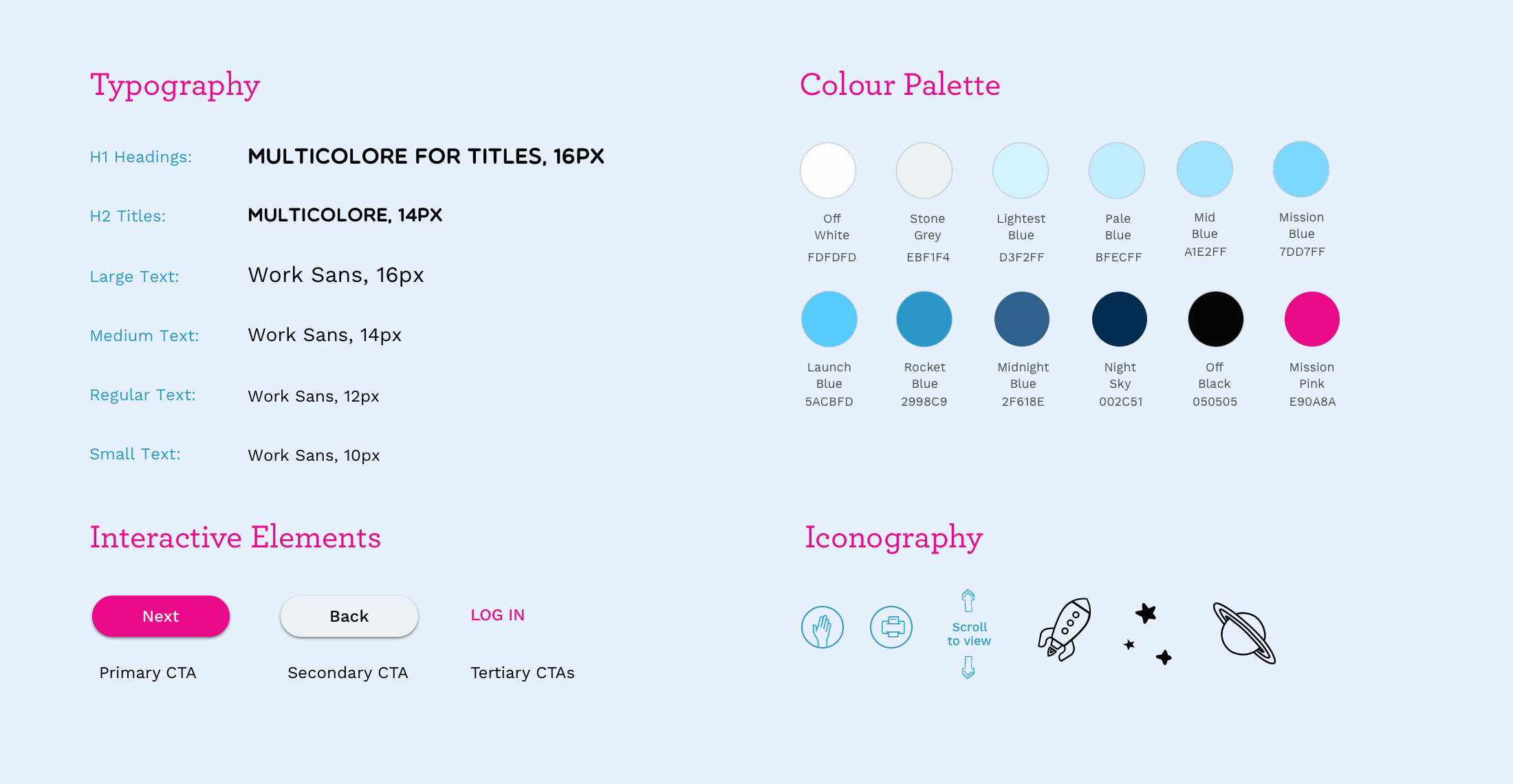
A summary of our style guide, with all the styles and interactive elements
Final designs
Take a look through some of our key screens in the carousel below: