
Improving the podcast and following experience at Spotify
My role: I worked on 2 main project areas at Spotify: planning a strategy to improve following, and making the podcast experience more intuitive for users. I also helped bring audiobooks to Spotify by designing the save experience.
Impact: My work made following on Spotify more intuitive and the tests we ran increased following as much as 8%. My work on podcasts increased show saves by 14% and consumption by almost 0.4%. The work my team did is currently being built and tested in Spotify’s new Home experience.

01. Planning an intuitive follow experience
Context
Spotify has in the past been uncommitted to a concept of “following” creators, preferring to rely on its algorithm to power the experience. However research suggested that both users and creators (artists, podcast hosts) expected more from following and that it could be really valuable to users, creators and Spotify.
The problem space
The “follow” feed (What’s New) was hidden away and only had 3.84% weekly active users;
What’s New was difficult to use and unengaging, with frequently released podcasts dominating over music;
Follow actions were too hidden away on rarely visited profile pages and not recommended to users apart from in onboarding (during which 74.7% of artist follows occurred);
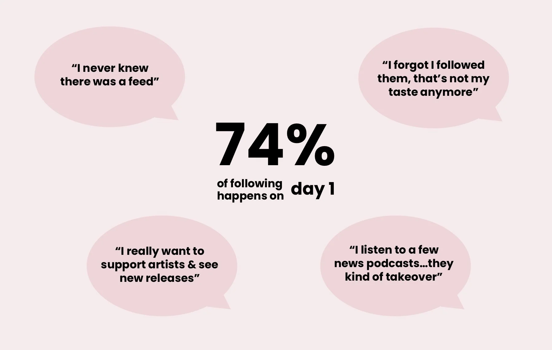
Key problems from qual and quant research
The upsides rapidly also became clear - we found during research that users expected following to be part of their Spotify experience, to allow them to discover new releases, support the creators they loved, and to manage or “bookmark” the creators to find them easily. Creators were also requesting a consistent way to reach their fans - as well as monetise.

Opportunities for users, artists and Spotify
Our approach
We worked with a cross section of teams to see how we could make the follow experience more intuitive and valuable, working with them and their developers to test and launch improvements faster. Note: see my “process” section for more on how I organise projects, from running workshops and prioritising to prototyping and testing.
The core improvements we worked across were:
A clear feed: we qual tested different approaches to incorporating follow onto Home, or as a new navigation tab, seeing which would be more intuitive for users);
Rationalising the feed: we qual tested aggregating podcasts so that they didn’t dominate (most podcasts release daily, some even hourly) and quant tested subtle ranking to de prioritise podcasts that were followed “aspirationally”;

Some of the feed and aggregation explorations
Ease of following: we quant tested putting the follow action across more surfaces, including the playing view and search, worked on new components for Home that could support a follow action, and tested a follow recommendation carousel;

Some of the tests we ran.
Success
A clear feed: Overall user research found that users appreciated more prominence for their followed artists and podcasts and the separation of content type offered. We developed a roadmap for future improvements based on different outcomes. Spotify is currently testing one of the designs that performed well during user testing and I’m limited in how much I can share.
Rationalising the feed: In qual testing, users felt that aggregating episodes made the feed less overwhelming and helped them find their latest episode. In quant testing subtle ranking to prioritise highly engaged shows, and deprioritise aspirational shows led to a small but statistically significant increase in podcast consumption.
Ease of following: Following increased by 8% when follow was introduced onto the playing view “scroll”, and by 3% when added to search results. As part of the search test we also saw 6% more users following creators (we believe because they became aware of following being available). Follow recommendations in profile led to 6.9% more users following an artist and the total number of artists followed increased by 7.2%.
One of the prototypes we used for stakeholder conversations and testing
02. Improving the podcast experience
Context
As Spotify was originally designed as a music only app, introducing podcasts and other content types (most recently audiobooks) led to many integration challenges and painpoints for users. Myself and my team (of 8 developers, 1 PM, supported by a user researcher and data analyst) worked on a number of projects aimed at addressing some of the core painpoints for podcast users. I have outlined some of the key projects we worked on below.
Supporting continue listening
Through a large scale study and smaller research sessions we found that one of the key painpoints for podcast listeners was finding unfinished episodes. A “continue listening” type experience hadn't been given much prominence on Home (given it being less important for music) and the algorithmically controlled Home experience could be frustrating for podcast listeners who tended to value consistency. Teams across Spotify were also struggling to balance the needs of different content types and considering how these could be met while maintaining a unified experience.
“It can be difficult to get back to the last played episode”
We kicked off a project to explore how continue listening would best be incorporated into the experience, and how we could design the UI to scale to different content types - as well as the quantity of podcasts some users listened to.

Continue listening improvements, temporary design
Our explorations and user research led to continue listening being given more prominence and predictability on Home (which was where the majority of users expected to find it). It also helped teams across Spotify realise that users did not want to mix content types and tended to visit Spotify with a specific aim in mind depending on their mood, time available and environment. For example podcasts require more focus than music and would usually be listened to in calmer settings and when the user has more time.
This work is ongoing as part of Spotify’s new Home design and therefore I am limited in how much I can share but early quant testing suggested that continue listening could play a large part in increasing retention and consumption metrics.
Helping users know how to save
Another core painpoint for podcast listeners was saving episodes. We found that users found the save experience confusing and inconsistent. As part of a broader project that worked to align saving on Spotify (using a + icon across the board in place of the heart previously used for songs) we looked into how we could display the action more prominently to help increase saves and familiarity with the action.
One example was adding the save action to the playing view for podcasts. Previously there had been some resistance to adding the save action to the interface as podcasts are less often added to playlists or repeat listened. However, our continue listening work had shown that users often couldn’t finish an episode in one sitting, and valued being able to save for later. We ran an A/B test (and then a monitored rollout) which increased podcast saves by 14% as well as increasing podcast consumption overall by almost 0.4%.

A small change with a big result: adding the save action in the playing view for podcasts
Helping users retrieve saved episodes
Following our work above we spent some time looking at how we could help users retrieve saved episodes. We saw that around 15% of MAU saved episodes, but only around 4% listened from the saved location - Your Episodes. Part of this was because saved episodes were offered on Home, but we also knew from qual research that many users were unaware of where to find saved episodes and confused by the experience.
As well as helping with efforts to pin Your Episodes to the top of the Library, and looking into new names and iconography with our copywriters, we worked on iterations of a snackbar and onboarding to help with retrieval. We explored a snackbar that would help users become more familiar with the name and icon of saved locations as well as link through to the saved location. And onboarding that would pop up in the Library only if you had recently saved an episode and had not yet visited Your Episodes. The test increased retrieval from Your Episodes by over 1%, rollout is waiting for next steps around the icon and naming of Your Episodes.

Our new snackbar to help users understand how to find saved content
03. Helping integrate audiobooks into Spotify
I helped to integrate audiobooks onto the Spotify platform by designing the saving experience.
Step 1 was to take the experience we have for podcasts and music and replicate it for audiobooks with subtle tweaks to accommodate the way audiobooks had been integrated and technical limitations.
Step 2 was to think about how we could encourage audiobook users to create their first playlist. Although users would be unlikely to listen to several books one after each other (bar children’s books) we wanted to keep consistency across content types and knew that playlists could be helpful to users for creating wishlists and lists of books to share with friends. We’d seen this behaviour during user research (users tended to collect wishlists and batch collect books) - and it also matched our business aim to encourage users to revisit after listening to their first audiobook.